Revamping the Meal Prep Experience for Freshly
TIMELINE
Dec 2019- Jan 2022
PLATFORM
iOS & Android App
MY ROLE
Lead UX/UI Designer
Introduction
In today’s fast-paced world, convenience and customization are essential to users seeking meal prep solutions. Freshly, a popular meal delivery service, helps customers enjoy nutritious, chef-prepared meals without the hassle of cooking. However, feedback revealed that Freshly’s app users often faced challenges in meal selection, customization, and scheduling, which hindered the overall experience.
In this case study, we’ll explore the process behind redesigning Freshly’s app interface and user flow to create a more intuitive, personalized meal prep experience. Our goal was to simplify the ordering process, improve meal filtering and selection, and provide a seamless experience that keeps users engaged and satisfied. By the end of this revamp, Freshly users could enjoy a smoother, more enjoyable path from meal selection to delivery, ultimately boosting customer retention and satisfaction.
My Role
As the lead UX/UI designer, I conducted user research, designed wireframes, and built prototypes to enhance Freshly's meal prep experience, collaborating with cross-functional teams for a smooth, user-focused outcome.
The Problem
Freshly users faced challenges in meal selection, customization, and scheduling, leading to frustration and drop-offs during the ordering process. The app's user flow lacked intuitive navigation, making it difficult for users to personalize and manage their meal choices efficiently.
PROBLEM #1
Complex Meal Selection Process
Users struggled to navigate Freshly's meal selection options, finding it overwhelming to browse and filter meals that fit their dietary preferences. This made it difficult to quickly identify suitable meals, leading to frustration and decreased satisfaction.
PROBLEM #2
Limited Customization Options
Freshly's app lacked flexibility for users who wanted to customize portions or swap ingredients, limiting their ability to personalize orders. This absence of customization options left users feeling that the service didn’t fully meet their unique dietary needs.
PROBLEM #3
Confusing Scheduling Interface
Many users reported issues with the scheduling feature, finding it hard to adjust delivery dates or skip upcoming weeks. The interface’s lack of clarity led to accidental deliveries and cancellations, reducing trust in the service and impacting user retention.
Defining the problem
How might we simplify the meal selection process to help users quickly find options that align with their dietary preferences and taste?
Goals
BUSINESS GOALS
USER GOALS
Impact
The Freshly app redesign significantly improved user satisfaction and engagement.
15
%
Increase in customer retention
12
%
Boost in average order value
25
%
Reduction in checkout drop-off rate
Our Users
Our users are busy individuals seeking convenient, nutritious meal solutions. They value easy customization, flexible scheduling, and a streamlined experience to help them enjoy healthy meals without the hassle.
The Busy Professional
An efficiency-driven individual seeking convenience—Alex is a busy marketing manager who values quick, healthy meal options that fit into a hectic schedule, with a high preference for customization.
JOBS-TO-BE-DONE
When I select my meals for the week, I want to quickly find healthy options that fit my dietary preferences, so I can stay on track with my goals without spending too much time browsing.
The Health-Conscious Parent
A family-focused user looking for variety and nutrition—Jamie is a stay-at-home parent aiming to provide wholesome, balanced meals for the family, with an interest in flexible scheduling and meal customization.
JOBS-TO-BE-DONE
When I plan meals for my family, I want to schedule deliveries and customize portions easily, so we can enjoy nutritious meals that cater to everyone’s tastes and needs.
Process
Design Sprints
We conducted a five-day design sprint to redesign key areas of the Freshly app experience. By understanding user challenges, brainstorming solutions, and rapidly prototyping, the team aimed to simplify meal selection, enhance customization, and improve scheduling. Testing with real users validated these changes, ensuring an intuitive, engaging meal prep experience.
User Flows
This user flow outlines the journey a Freshly user takes to complete key actions within the app, from browsing meals to finalizing their order. It maps each step—such as selecting dietary preferences, customizing meal options, and setting delivery schedules—to ensure a seamless and intuitive experience.
By streamlining these paths, the flow reduces friction, guides users effortlessly, and encourages retention and satisfaction.
Sketches
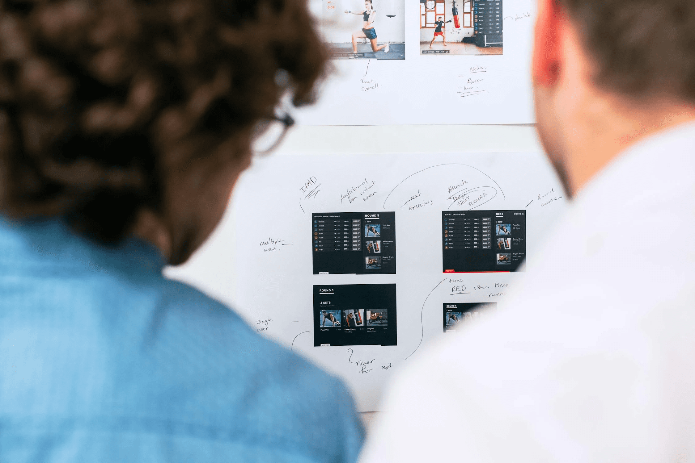
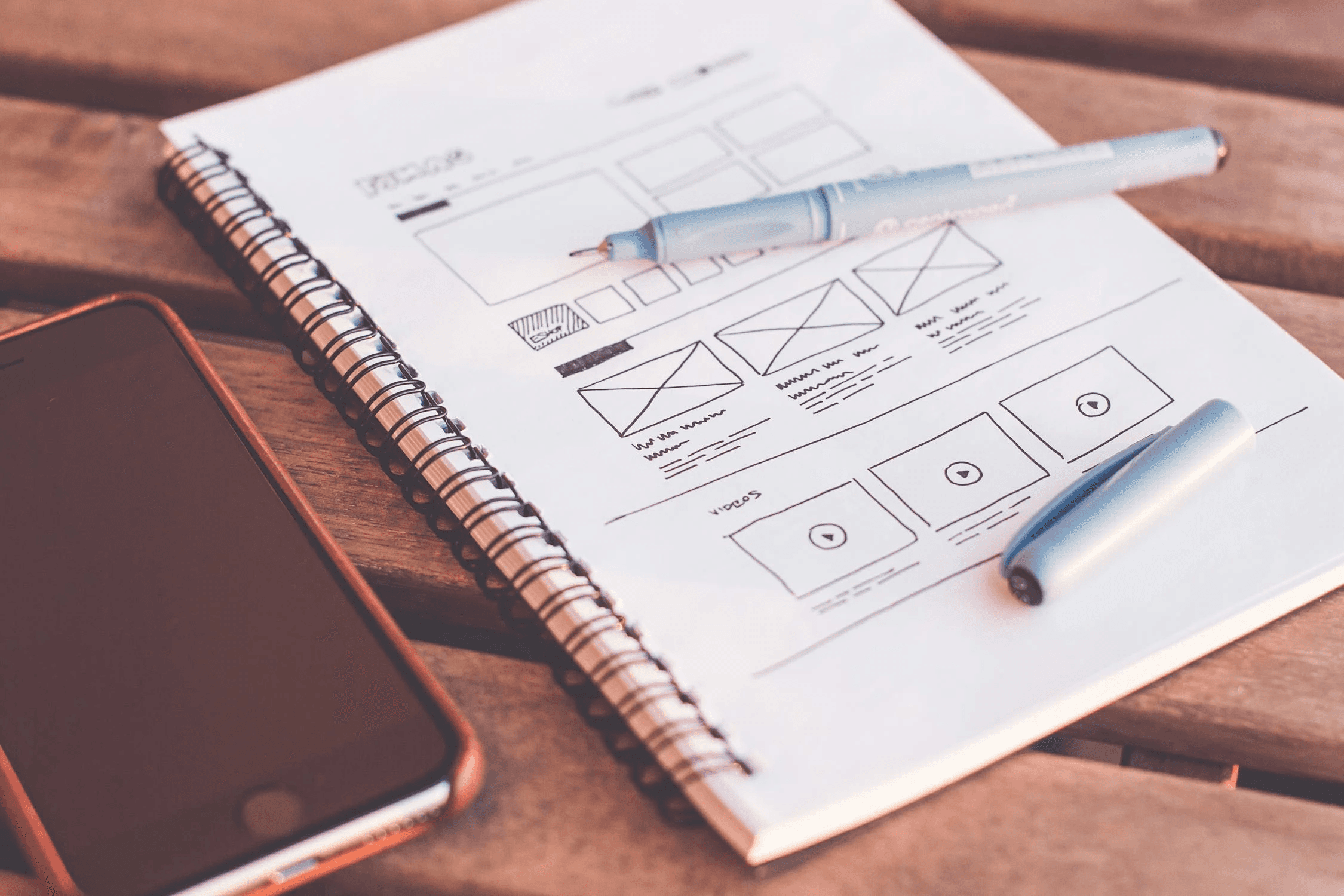
The initial sketches laid out rough concepts for meal selection, customization, and scheduling screens, helping visualize solutions quickly. These low-fidelity drafts guided the structure and flow, setting the stage for detailed wireframes.
Early designs
The early designs included low-fidelity wireframes and prototypes, focusing on a streamlined layout for meal selection, customization, and scheduling. These initial iterations allowed for quick feedback and refinements, ensuring alignment with user needs before moving into high-fidelity design.
Meal Selection Page
We aimed to create a simple, intuitive meal selection screen where users could easily browse and filter meal options. These early designs were discarded due to a lack of visual hierarchy, making it difficult for users to quickly identify meals that matched their preferences. The cluttered layout and excessive text contributed to a poor user experience.
Delivery Scheduling Page
For scheduling deliveries, we wanted to make it easy for users to select delivery dates and skip weeks. The initial design had an overly busy calendar interface that confused users, with unclear navigation and redundant options. After feedback, we simplified the interface to provide a clearer, more intuitive scheduling experience.
Accounts Setting Page
The account settings design aimed to give users quick access to profile information and subscription preferences. Early drafts lacked visual organization and made it difficult to find important features. We adjusted the layout and improved labeling to create a more user-friendly, organized design.
Final Designs
Here is a showcase for the newly designed Freshly app streamline meal selection, customization, and scheduling, offering a clean, intuitive interface that enhances usability and addresses key user pain points.
What we learned
Future
This venture has been profoundly gratifying for me! I'm blessed to explore and grasp plenty along with my peers in design and development.
