Enhancing Connections with LinkUp App

TIMELINE

June 2024- Oct 2024

PLATFORM

iOS & Andriod App

MY ROLE

Lead UX/UI Designer

Introduction

We explore the redesign of LinkUp, an app aimed at creating seamless networking experiences. By addressing user pain points in navigation and usability, we enhanced LinkUp’s core features to make connecting with others easier and more intuitive. This process involved user research, iterative design, and testing to ensure a polished, user-centered result that better supports professional networking goals.

My Role

As the Lead UX Designer for the LinkUp app project, I focused on improving user engagement by enhancing the app’s connection features. My responsibilities included conducting user research to understand networking needs, mapping user journeys, and identifying key obstacles in the connection process. I redesigned the interface to make it easier for users to find and connect with others, added streamlined features to enhance user interaction, and incorporated feedback from usability testing. Through iterative design and testing, I helped create an app experience that fosters meaningful connections, ultimately boosting user satisfaction and engagement.

The Problem

LinkUp app users struggled to find and connect with relevant contacts, leading to low engagement and limited networking opportunities. The app needed a redesign to improve ease of connection, streamline interactions, and enhance user satisfaction in building meaningful connections.

Audience and Pain Points

LinkUp app primarily targets professionals and networkers looking to connect with peers, industry leaders, and potential collaborators. This includes individuals in tech, business, and creative industries, ranging from early-career professionals to seasoned experts.

Audience and Pain Points

LinkUp app primarily targets professionals and networkers looking to connect with peers, industry leaders, and potential collaborators. This includes individuals in tech, business, and creative industries, ranging from early-career professionals to seasoned experts.

Audience and Pain Points

LinkUp app primarily targets professionals and networkers looking to connect with peers, industry leaders, and potential collaborators. This includes individuals in tech, business, and creative industries, ranging from early-career professionals to seasoned experts.

1. Complex Navigation

Users find it difficult to navigate the app and locate relevant profiles or networking opportunities.

1. Complex Navigation

Users find it difficult to navigate the app and locate relevant profiles or networking opportunities.

1. Complex Navigation

Users find it difficult to navigate the app and locate relevant profiles or networking opportunities.

2. Limited Connection Features:

The existing features do not facilitate easy, meaningful interactions between users, making networking feel transactional and impersonal.

2. Limited Connection Features:

The existing features do not facilitate easy, meaningful interactions between users, making networking feel transactional and impersonal.

2. Limited Connection Features:

The existing features do not facilitate easy, meaningful interactions between users, making networking feel transactional and impersonal.

3. Inefficient Matching

The app fails to suggest valuable or relevant connections, leading to user frustration and reduced engagement.

3. Inefficient Matching

The app fails to suggest valuable or relevant connections, leading to user frustration and reduced engagement.

3. Inefficient Matching

The app fails to suggest valuable or relevant connections, leading to user frustration and reduced engagement.

4. Poor User Experience

The interface feels cluttered, which impacts users' ability to efficiently explore potential connections and manage their profiles.

4. Poor User Experience

The interface feels cluttered, which impacts users' ability to efficiently explore potential connections and manage their profiles.

4. Poor User Experience

The interface feels cluttered, which impacts users' ability to efficiently explore potential connections and manage their profiles.

5. Low Retention Rates

Users struggle to see value in returning to the app due to a lack of engaging features and poor connection outcomes.

5. Low Retention Rates

Users struggle to see value in returning to the app due to a lack of engaging features and poor connection outcomes.

5. Low Retention Rates

Users struggle to see value in returning to the app due to a lack of engaging features and poor connection outcomes.

Defining the Problem

How might we redesign the LinkUp app to simplify navigation, improve connection features, and create a more engaging and personalized networking experience for users?

Research & Insights

Research Methods

For this case study, we used user interviews, surveys, app analytics, and competitive analysis. Interviews and surveys revealed user pain points, while analytics highlighted areas of low engagement. Competitive analysis helped inform the redesign by identifying industry best practices.

Key Research Insights

After we conducted many different research methods like interviewing and surveys, we got a handful of essential insights from our users.

Key Research Insights

After we conducted many different research methods like interviewing and surveys, we got a handful of essential insights from our users.

Key Research Insights

After we conducted many different research methods like interviewing and surveys, we got a handful of essential insights from our users.

1. Navigation Struggles

Users found it difficult to navigate the app and locate relevant profiles or networking opportunities.

1. Navigation Struggles

Users found it difficult to navigate the app and locate relevant profiles or networking opportunities.

1. Navigation Struggles

Users found it difficult to navigate the app and locate relevant profiles or networking opportunities.

2. Lack of Personalization

Many users felt the app’s connection suggestions were generic and not tailored to their professional interests.

2. Lack of Personalization

Many users felt the app’s connection suggestions were generic and not tailored to their professional interests.

2. Lack of Personalization

Many users felt the app’s connection suggestions were generic and not tailored to their professional interests.

3. Low Engagement

Users didn’t return to the app often because they didn’t see ongoing value in the connections they were making.

3. Low Engagement

Users didn’t return to the app often because they didn’t see ongoing value in the connections they were making.

3. Low Engagement

Users didn’t return to the app often because they didn’t see ongoing value in the connections they were making.

4. Cluttered Interface

The app's design felt overwhelming, making it hard for users to focus on important features like messaging or connecting.

4. Cluttered Interface

The app's design felt overwhelming, making it hard for users to focus on important features like messaging or connecting.

4. Cluttered Interface

The app's design felt overwhelming, making it hard for users to focus on important features like messaging or connecting.

5. High Drop-off Rates

Users abandoned the app early due to difficulty in completing their profiles and starting meaningful connections.

5. High Drop-off Rates

Users abandoned the app early due to difficulty in completing their profiles and starting meaningful connections.

5. High Drop-off Rates

Users abandoned the app early due to difficulty in completing their profiles and starting meaningful connections.

These insights are what gave us the root to the problem that users are having with the app.

These insights are what gave us the root to the problem that users are having with the app.

These insights are what gave us the root to the problem that users are having with the app.

Ideation & Concepting

Here, we focused on creating personalized connection suggestions and simplifying navigation to enhance user engagement. We developed wireframes and prototypes to visualize these concepts and tested them with users to refine the design.

Brainstorming Highlights

In brainstorming, we focused on personalized connection suggestions, simplified navigation, enhanced messaging features, and customizable networking filters. We also proposed streamlining the onboarding process to help users connect more easily.

Brainstorming Highlights

In brainstorming, we focused on personalized connection suggestions, simplified navigation, enhanced messaging features, and customizable networking filters. We also proposed streamlining the onboarding process to help users connect more easily.

Brainstorming Highlights

In brainstorming, we focused on personalized connection suggestions, simplified navigation, enhanced messaging features, and customizable networking filters. We also proposed streamlining the onboarding process to help users connect more easily.

Wireframing/ Low-Fidelity Prototypes

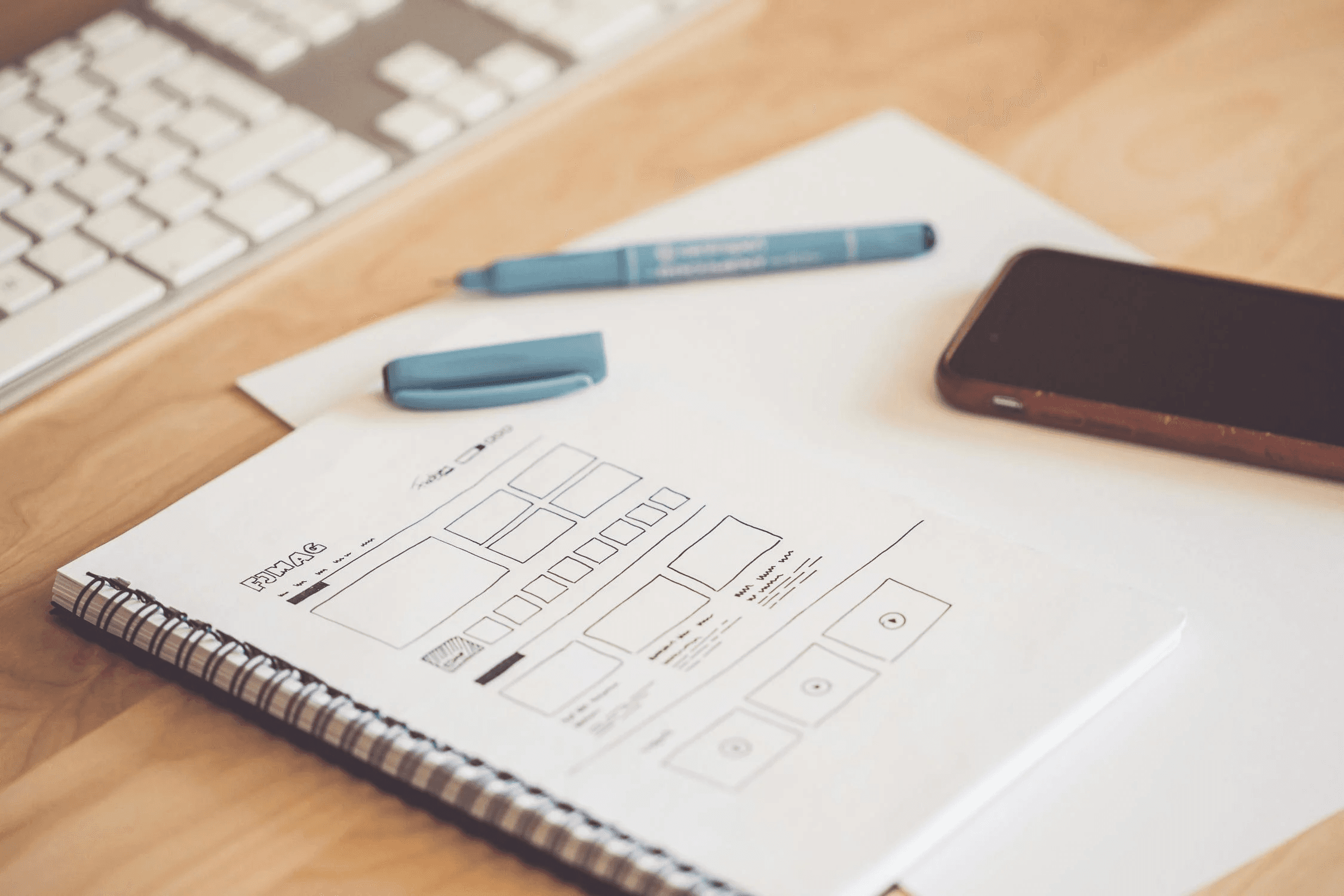
We created low-fidelity layouts to visualize the new app structure and features. These wireframes focused on simplifying the user flow, with an emphasis on easy navigation, personalized connection suggestions, and a streamlined messaging interface. The goal was to ensure clarity and ease of use before moving on to higher-fidelity designs.

Design and Prototyping

From creating low-fidelity to high-fidelity mockups, focusing on intuitive navigation and accessibility, while refining visual elements for a user-friendly interface.

High-fidelity Designs

Taking the designs from our low-fid, we created detailed designs with final visuals, including colors and typography. Interactive prototypes were developed for user testing to ensure functionality and alignment with project goals.

High-fidelity Designs

Taking the designs from our low-fid, we created detailed designs with final visuals, including colors and typography. Interactive prototypes were developed for user testing to ensure functionality and alignment with project goals.

High-fidelity Designs

Taking the designs from our low-fid, we created detailed designs with final visuals, including colors and typography. Interactive prototypes were developed for user testing to ensure functionality and alignment with project goals.

Interactive Prototype

The interactive prototype was a fully functional version of the app, showcasing the final design elements and user flow. It allowed users to navigate through the app’s features, such as personalized connections and messaging, providing valuable insights into the usability and overall experience before development.

Feel free to experience the prototype for yourself here!

Testing and Iterations

We conducted user testing with the interactive prototype, gathering feedback on navigation, connection features, and overall usability. Based on insights, we made iterative improvements to enhance the user experience, refine the design, and ensure it met user needs and expectations.

Usability Testing

In user testing, we evaluated the updated design with real users to assess navigation ease, accessibility features, and overall satisfaction. Feedback on the new layout and accessibility improvements allowed us to make targeted adjustments, ensuring an intuitive, user-centered experience for all.

Before & After Changes

Before the redesign, users struggled with complex navigation and lacked personalized connection suggestions. Based on user feedback, we simplified the interface, introduced tailored connection recommendations, and improved the messaging system. These changes made the app more intuitive, helping users connect more easily and engage meaningfully.

Navigation

Before

Before

Complex and cluttered, making it difficult for users to find key features.

Complex and cluttered, making it difficult for users to find key features.

After

After

Simplified layout with clear pathways to essential features, improving ease of use.

Simplified layout with clear pathways to essential features, improving ease of use.

Connection Suggestions

Before

Before

Generic and irrelevant recommendations.

Generic and irrelevant recommendations.

After

After

Personalized connection suggestions based on user interests and activity.

Personalized connection suggestions based on user interests and activity.

Messaging Interface

Before

Before

Basic and difficult to navigate conversations.

Basic and difficult to navigate conversations.

A phone screen showing a mobile banking app with a notification for a $25.00 payment.

After

After

Enhanced messaging interface with quick replies and a search feature for easier conversation management.

Enhanced messaging interface with quick replies and a search feature for easier conversation management.

A smartphone with an app icon on the screen, connected to other icons representing different features or services.

Outcomes and Results

The redesign led to improved user engagement, higher retention, and increased successful connections, with users reporting greater satisfaction thanks to personalized features and a more intuitive interface.

23

%

Increase in user engagement

30

%

Increase in customer rentention

35

%

Reduced in drop-off rates

Learnings & Future

LEARNINGS

  • Simplified navigation significantly enhances user experience and engagement.


  • Personalization drives greater user satisfaction and increases connection success.


  • Streamlined onboarding reduces friction and accelerates user adoption.


  • Continuous user feedback is crucial for refining design and ensuring it meets user needs.


  • Testing prototypes early helps identify pain points and optimize features before launch.

FUTURE

  • Implement additional filters for personalized connection recommendations based on user feedback.


  • Introduce new features like event-based networking and group discussions to further enhance engagement.


  • Continuously monitor user behavior to identify new pain points and areas for improvement.


  • Expand accessibility features to ensure the app is inclusive for all users.


  • Conduct regular user testing to refine the app based on evolving needs and preferences.

The redesign of the LinkUp app successfully addressed key user pain points by simplifying navigation, personalizing connection features, and enhancing the messaging experience. These changes led to improved user engagement and satisfaction, demonstrating the power of user-centered design. Moving forward, continuous iteration and user feedback will be essential to further refine and elevate the app’s capabilities, ensuring it remains a valuable tool for meaningful professional connections.